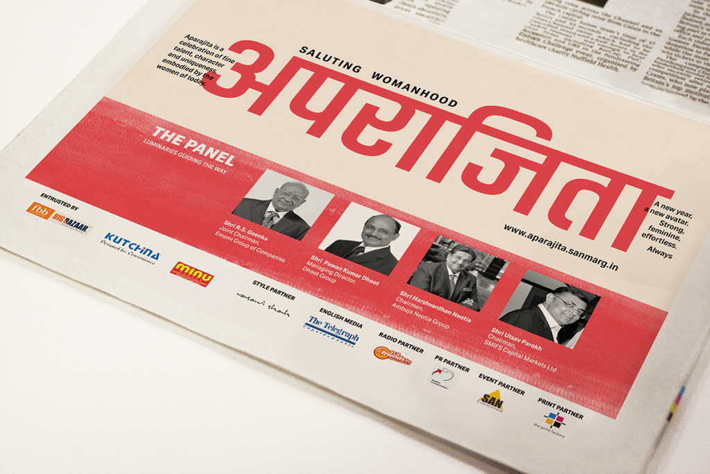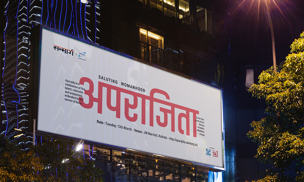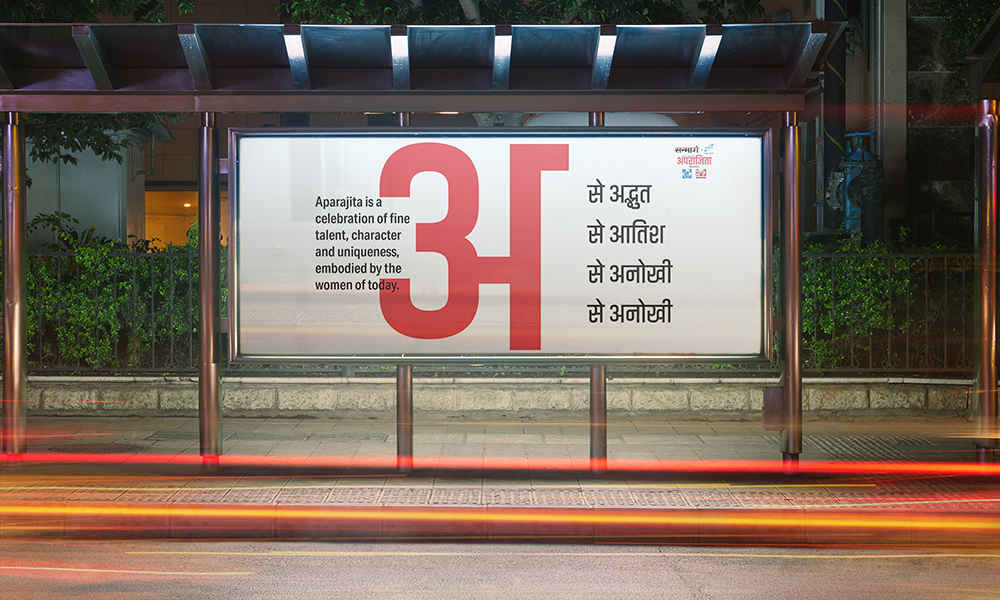
‘Aparajita’ is an awards initiative celebrating women who have had the courage to follow their hearts and in the process, leave prominent trails across disciplines, creating new benchmarks and inspiring others along the way. Started under the aegis of Sanmarg – the largest and most widely read Hindi daily in Eastern India – in 2010, the thought stems from a single premise: Saluting Womanhood.
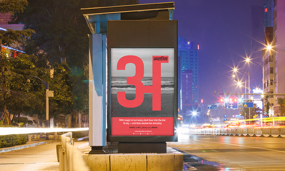
For the 2018 edition, they wanted to re-invent and re-establish their brand aesthetics (across disciplines), much like the changing image of the Indian woman – Effortless, strong and feminine. Drawing parallels between womanhood and nature, this year’s mood delved into the elements of nature and the essence of womanhood.
Concept Direction: The Space at 9 by 2

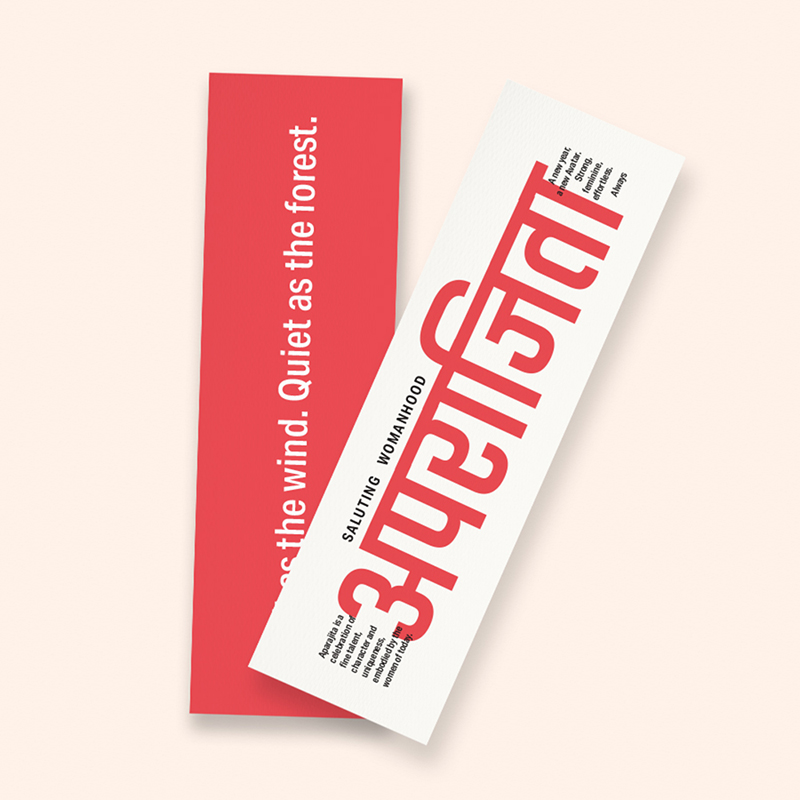


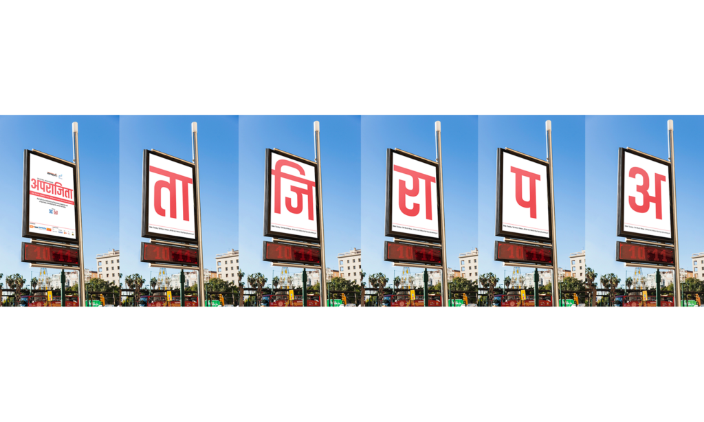
One of the key areas of focus – while re-branding – was to depict the ethos behind the brand through the Devnagri script. Often used in more traditional contexts – we were to highlight the script (as it was the main language of communication) as a contemporary visual form. A corresponding Latin script was also used (as a secondary font) for the English versions to reach out to non-Hindi-speaking audiences.
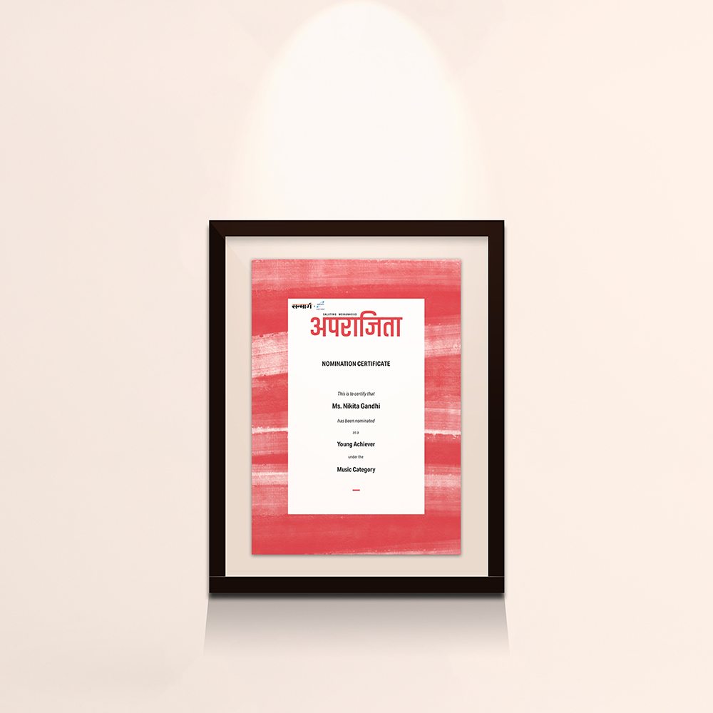

The colour red has been playing an instrumental role in Indian customs and traditions – often symbolising love, belief and power. Thus, the red-vermilion colour tone became an important part of the identity. The Devanagari ‘अ’ (Font: Akhand Devnagri by Indian Type foundry) mingled with red became a strong symbol of a powerful yet rooted individual – symbolising the virtue, Sanmarg wished to honour & celebrate.
Since these awards were a prominent part of the newspaper’s annual initiatives, since 2010, they wanted to use print and digital collaterals with print ads to gradually reveal the new identity and concept.